Many clients come to our agency with the desire to improve the performance of their websites and often ask the same questions: Why is my bounce rate so high, or the percentage of abandonment without interaction with page? and Why do I get complaints from users who can’t find what they are looking for? Well, these are tangible signs of areas for improvement in User Experience (UX) design.
Whether you are restructuring your site or you are in the early stages of web development, it will be extremely useful to understand in simple language what optimized design is all about and what the current UX best practices are.
User experience encompasses all aspects that play a role in customer interaction with a website. If we are interested in evaluating the ability of a page to provide solutions to consumers’ needs, we will have to consider the following aspects: graphic design, navigation structure, loading speed and content. Let’s take a look at each one.
1. GRAPHIC DESIGN
A graphic line that aims at user satisfaction must generate a certain visual impact and at the same time favor usability, or the ease of use of the page.
A consistent and uniform design is part of the strategy used to achieve intuitive navigation and to remove ambiguities that can cause disorientation. In that sense, visual aids give clear information to the user about where they are in their virtual tour and how they can easily navigate to other areas of the site.
Equally important is persuasive design, with the ability to capture and retain our customer’s attention. Designers use data from segmentation and usability testing to make decisions about color, composition and the use of animations to stimulate emotions that reinforce the brand narrative and guide the consumer on the path to conversion.

Below you will find some design trends that currently stand out for their conversion power:
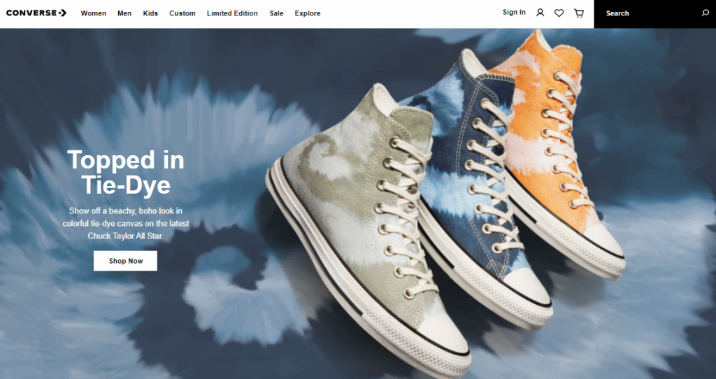
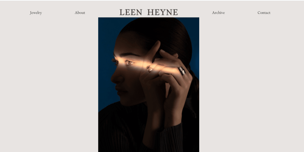
* MINIMALISM: The rise of digital media has caused information saturation, which is why the design proposals are committed to simplicity and simplification; thus, creative approaches are explored that give meaning to a comprehensive story, without falling into excess.
* DEGRADED SHADES AND BLURRY BACKGROUNDS: The use of gradients continues to be popular and among them the most complex, colorful combinations of light and overlapping shades are distinguished.
* ILLUSTRATIONS: Illustrations are now more elegant and experimenting with unusual angles, proportions and stories. Light colors are used with a bright or very muted look.
* PASTEL COLORS: On the line of simplicity the choice of pastel colors gives lightness to the design and accentuates the elegant style.
* ICONS: Minimalist icons have great potential to transmit and give strength to messages, keeping the same basic design and dimensions.
* GLASSMORPHISM: This is an effect of blurring of the background or blurred background, which when viewed gives the impression of looking through a glass. It denotes a simple style but with visual impact.
* COMPLEX TYPOGRAPHY: Using more complex typographies makes the message more attractive in a context of simplification; let us also remember that on the web we do not read but scan the text, so the variants in the fonts give freshness to the visual proposal and serve to enhance the message to be conveyed.

2. NAVIGATION ARCHITECTURE
An efficient structuring of the content is the furthest thing from a complex navigation design. Symmetrical architecture favors the intuitive navigation of a website, in a way that the mind can quickly grasp the design, without using the brain’s memory load.
The main trend in this area is to create a simplified user experience, where super clear navigation paths are provided for the user to access the content very easily, with minimum effort and in the shortest possible time. This translates into fewer clicks, searches and fields to fill out, optimizing shorter forms and expedited payment processes.
An inattentive design forces the user to take more steps than they should or to find themselves without knowing where to go, which will lead to discomfort and abandonment of the site before conversion.

3. LOADING SPEED
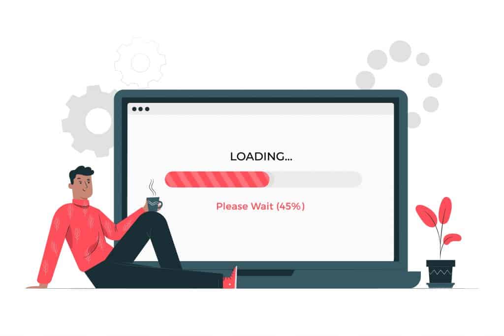
It is very clear that the loading speed has a direct effect on the user’s perception, a delay of a few seconds results in the immediate abandonment of the site, so in the process of configuring the graphic and multimedia content, its effect on the speed is taken into account.
Competition on the web is high, Google is increasingly demanding in its positioning standards and user expectations regarding the quality of sites is also higher; statistics show that consumers expect a site to load in three seconds or two if it is an e-commerce site, it is stated that 40% of users will not wait more than three seconds before abandoning a site.
Optimal loading speed improves user satisfaction and overall page performance.

4. CONTENT
Content is king and the importance of providing valuable information that meets the information needs of your audience is more than understood, however, it is also highly relevant to properly prioritize the content and organize it around search intentions, as well as the successful implementation of calls to action.
One aspect that has become central in web design is the creation of effective accessibility principles, taking into account the auditory, cognitive, neurological, physical, visual and speech diversity of users who may come into contact with the web. Based on this idea, the incorporation of subtitles in videos, the use of legible font sizes for all, the use of simple and understandable language, among many other principles of inclusion are considered.
We always explain to our clients that in order to motivate users to take action, convert and keep coming back, it is essential to perceive web design from a holistic perspective; ignoring that the components are closely related leads to poor site performance and our frustration.
It is useless to generate the best possible content if people cannot access it, because they do not understand how to interact with the page or because it simply does not load; it is also counterproductive to emphasize graphic design but present irrelevant content, whatever the form, ignoring this correspondence will lead to the same result: traffic will bounce. So, having a more general and complete picture, maybe it is time to rethink the user experience design of our website.


